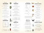


Browsing menu inspiration is enjoyable and mostly useless, because a photo of a beautiful menu doesn’t tell you the trim size, the type sizes, or how many items the layout can actually hold before it falls apart.
So this is a working list. Twelve restaurant menu design ideas, each with the format, the structure and the constraints that make it work, enough to hand to a printer or rebuild in a design tool this week. They’re organised by the decision you’re making: the overall format first, then covers, then section structure, then type, then the phone version. For the reasoning underneath the choices (why position inside a section beats position on the page, how price formatting changes spend), see our guide to restaurant menu design. This page is the shapes; that one is the why.
The Bottom Line: Pick your format from your item count, not your aesthetic. Under about 20 items, a single page is almost always right. Twenty to forty wants a bi-fold or a two-panel single sheet. Above forty, use a tri-fold or separate menus by daypart rather than adding pages. Then keep to two typefaces, cap each section at five to seven items, and build the phone version as its own single-column layout rather than a PDF of the print one.
Lower your delivery costs by 23%
How we reduce costs:
- No delivery vehicle expenses
- Optimized local routes
- Pay-per-delivery model
- Average 23% delivery cost reduction
How to choose a menu design idea that fits your restaurant
Count your items and count your price changes. Those two numbers eliminate most of the options before taste gets involved.
Item count sets the format: a layout designed for 18 dishes breaks visibly at 45, and a tri-fold built for 60 looks empty at 20. How often prices move sets the production method: a menu you reprint twice a year can be beautiful artwork, while a menu that changes weekly needs to be something you can regenerate without a designer.
| Format | Item range | Reprint effort | Works best for |
|---|---|---|---|
| Single page, one column | Up to ~15 | Lowest: one side, one file | Cafés, counter service, tasting-led kitchens |
| Single page, two columns | ~15–25 | Low | Bistros, neighbourhood restaurants |
| Single sheet, two panels (A3 folded) | ~25–40 | Low | Full-service with drinks on the reverse |
| Bi-fold card | ~25–40 | Medium: four faces to lay out | Full-service dinner menus |
| Tri-fold / takeaway leaflet | ~40–60 | Medium | Takeaway, delivery, long menus |
| Board or chalk wall | ~8–15 | None for prices, manual labour | Daily-change kitchens, counter service |
| Phone-first digital | Any | None: edit once | Every restaurant, alongside one of the above |
A note on the thing most operators get wrong here: adding pages is the worst way to solve a long menu. Separate menus (lunch, dinner, drinks, kids) each read better than one document trying to be all of them.
Single-page restaurant menu layouts
1. The one-column single page
One sheet, portrait, one column down the middle, sections separated by a rule or a small-caps heading. No columns to balance, no fold to work around.
Specs that make it work: A4 or 5.5 × 8.5in, generous outer margins (20mm minimum), item names at 11–12pt, descriptions at 9–10pt in the same family, section headings in small caps with space above but not below. Cap it at about 15 items or the page gets dense.
This is the most forgiving layout in existence and the one to default to if you’re unsure. It also photographs well, which matters when guests post it.
2. The two-column single page
Same sheet, two columns, with the heavier sections on the left because that’s where sequential reading starts. Holds 15 to 25 items comfortably.
The detail that decides whether this looks professional: do not try to make the two columns end at the same height. Let the shorter one end short and leave white space. Forcing them level means padding descriptions, which is how menus get wordy.
3. The single sheet, two-panel
An A3 sheet folded once to A4, so you get four faces but only two spreads. Food across the inside spread, drinks on the back, something minimal on the front.
This is the sweet spot for a lot of full-service restaurants: it holds 25 to 40 items without the layout gymnastics of a bi-fold card, and it’s cheap to reprint because it’s one sheet.
4. The tri-fold takeaway leaflet
Six panels, DL size when folded, designed to be read in the hand and to survive being pinned to a fridge. Order the panels by how people decide: popular items and combos on the front-facing inside panels, everything else behind.
Give the back panel over to your phone number, ordering link and hours in type big enough to read from across a kitchen. That panel is the reason the leaflet stays on the fridge.
5. The board menu
Eight to fifteen items, written up, changed daily. Works for daily-change kitchens and counter service, and removes reprinting entirely.
Two constraints people underestimate: handwriting has to be legible from the back of the queue, which means fewer items in bigger letters than instinct suggests, and you still need a printed or digital copy for people who want to read it sitting down and for anyone ordering off-premises.
Menu cover design ideas
6. The type-only cover
Restaurant name set large, centred, nothing else. No illustration, no tagline, no established-in date.
This is the cover that looks most expensive for the least effort, because it can’t be executed badly. If you have a wordmark, use it at a size that fills roughly a third of the panel width and leave the rest empty.
7. The single-detail cover
One small graphic element (a line drawing, a stamp, a single photographic texture) against a plain ground, with the name set small beneath it.
The discipline is in the word single. A cover with an illustration, a tagline, a border and a date reads as a flyer. Pick the one element you’d keep and drop the rest.
8. The material-as-design cover
No printed cover at all: a plain uncoated card stock, a kraft board, or a slim folder in a single colour, with the menu sheet inside. The texture does the work.
This is the cheapest premium-feeling option available, and it has an operational advantage: the cover is permanent and the insert is what gets reprinted when prices move. For a restaurant changing prices a few times a year, that difference is most of the printing budget.
Section structures that change what guests order
9. Two tight sections instead of five loose ones
Collapse “starters, small plates, sides, snacks” into one section. Guests do not need your internal kitchen categories, and five thin lists read slower than two solid ones.
A workable structure for most full-service menus is three food sections (to start, mains, to finish) plus sides as a short list rather than a section with its own heading. Keep each one under seven items.
10. The rotating section
A fixed structure with one section explicitly marked as changing: “this week”, “from the market”, “today’s board”. Everything else stays put.
This solves two problems with one layout decision. It gives you somewhere to put seasonal and surplus items without redesigning, and it gives regulars a reason to read the menu again instead of ordering from memory. Lay it out so that section is the easiest to reprint: a separate insert, a boxed panel, or a line in the digital menu you can edit.
11. The single highlighted item per section
One item per section gets a box, a tint, or bold on the name only. Not three, not six.
Where it goes matters more than what it looks like: guests read each category top to bottom in sequence, so the first two lines of a section are the ones that get read properly. That’s the slot. The menu design principles behind this go into the eye-tracking research, but the layout rule is short: one highlight, near the top, per section.
Typography pairings you can copy
Two typefaces, both already on your machine or free. Item names and headings in one, descriptions in the other.
- A serif for names, a sans for descriptions. The classic. Try a transitional serif at 11–12pt for item names against a humanist sans at 9–10pt for descriptions. Reads as considered without being fussy.
- One sans, two weights. Item names in medium or semibold, descriptions in regular, same family throughout. This is the modern menu design default and the hardest to get wrong.
- A display face for headings only. Script, slab or condensed display on section headings of one or two words; a plain sans everywhere else. Never set a line of ingredients in a display face.
- All caps for headings, sentence case for everything else. Small caps or letterspaced caps at a smaller point size than the item names makes headings read as structure rather than as content.
Two rules that apply to all four: left-align the body text, and keep item names and prices at the same size and weight so neither dominates.
Phone-first menu design ideas
12. The single-column scrolling menu
Build the digital menu as its own layout: one column, sections as sticky headings a thumb can jump between, item name and price on one line, description beneath in a lighter weight.
The specs to copy: minimum 16px body text, tap targets at least 44px tall, section navigation pinned to the top of the screen, and images, if you use them, compressed hard enough to load on a weak connection. Photos earn their place here in a way they don’t on a printed table menu, because a guest ordering from a phone has nothing else to judge the dish by.
What to avoid: publishing your print PDF behind the QR code. A two-column A3 layout opened on a phone needs pinching and panning, which is the exact friction the QR code was supposed to remove. If the two layouts come from the same item list rather than the same artwork file, they stay in sync and each one gets designed properly.
What you need to build any of these
Less than you’d think. All twelve are buildable in a free design tool. Canva and Adobe Express both offer free tiers with menu template libraries you can start from instead of a blank page, and both export a print-ready PDF.
The choice that matters is whether your menu lives as artwork or as data. Design tools hold it as artwork: change a price and you re-edit, re-export and reprint. Menu platforms hold it as a list of items and generate the print file, the web menu and the QR menu from that list, so one edit updates all three. If you reprint once or twice a year, artwork is simpler. If you have market pricing, weekly specials or frequent sold-outs, the data approach is what stops your printed menu, your website and your QR code from quoting three different prices.
For printing, the specs to give a printer are the same whichever route you take: trim size, 3mm bleed, CMYK, 300dpi, and an uncoated or matt-laminated stock in the 250–350gsm range for a card that lives on a table.
Frequently asked questions
What is the easiest restaurant menu layout to design?
A single page, one column, portrait, with sections separated by small-caps headings. There are no columns to balance and no fold to design around, so it’s very hard to make it look amateurish. It holds about 15 items before it gets crowded.
How many columns should a restaurant menu have?
One or two. One is cleaner and easier to read; two fits more items on the same sheet. Three columns only work on a wide format like a tri-fold panel or a board, because the column width gets too narrow for a line of description.
Should each menu section have the same number of items?
No, and forcing it is a common mistake. Sections should hold what they hold, up to about seven items each. Padding a short section to match a long one means inventing dishes or stretching descriptions, both of which cost you more than the asymmetry does.
What size should a restaurant menu be?
A4 or 5.5 × 8.5in for a single page, A3 folded to A4 for a two-panel sheet, DL for a tri-fold takeaway leaflet. Those are standard sizes, which means standard pricing from any printer. Custom trim sizes cost noticeably more and buy very little.
Can I use the same design for my print and digital menus?
Use the same item list and the same typefaces, but lay them out separately. A print layout opened on a phone needs pinching to read, and a mobile layout printed out wastes most of the page. Same content, same identity, two layouts.
Pick one and build it
The fastest route through this list: count your items, read the format table, and take the one row your count lands in. Then add a type pairing, one highlighted item per section, and the single-column phone version.
That’s a complete menu design, and none of it requires a designer or a budget. What it does require is deciding your format from your item count rather than from the menu you liked in a photograph. That is the one step that separates a menu that works from a menu that looks like it should.