
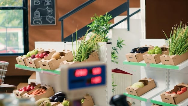

Your floor plan is the only employee that works every hour you’re open. It decides which way shoppers turn at the door, how much of your store they ever see, and whether the high-margin deli case gets walked past or walked through.
That last part is why layout is a money question, not a decorating question. Independent grocers run on a net profit of about 2% of sales, so a layout change that lifts the average basket by a dollar lands almost entirely in the part of the P&L you care about. If you want the full picture of where those pennies come from, our breakdown of grocery store profit margins and the levers that widen them covers the numbers department by department.
This guide stays on the floor plan itself: which layout type fits your building, what order the departments should go in, how wide the aisles need to be, and how to tell whether a change actually worked.
The Bottom Line
- Shoppers don’t walk every aisle. In a five-month study of 60,000 shoppers in a Portland-area supermarket, a perimeter pattern dominated and the average shopper covered only about 25% of the store (MarketingSherpa, on Herb Sorensen’s PathTracker research).
- The four workable grocery floor plans are the grid, the loop, the free-flow and a mixed plan that uses a perimeter loop with a center-store grid. Most stores over 8,000 square feet end up at the mixed plan.
- Fresh departments belong on the perimeter path because they carry the higher gross margins and the highest shrink. Research on grocery block layout finds that even small changes to department placement can measurably move impulse purchases (Ozgormus and Smith, Computers & Industrial Engineering).
- Online orders are now part of the floor plan. U.S. online grocery hit a record 20.9% share of grocery spending in Q3 2026, with delivery driving about three-quarters of the growth (Brick Meets Click, via The Shelby Report).
- Judge any layout change on basket size and department sales per square foot over four to six weeks, not on whether the store looks tidier.
Save 80% of delivery management time
We handle everything:
- Dedicated operations manager
- Real-time tracking dashboard
- Automated customer notifications
- Urgent issue resolution
What your store layout controls: traffic, dwell time and basket size
A layout does three measurable things. It sets the path most shoppers take, it sets how long they stay on that path, and it sets which products are within arm’s reach while they’re on it.
The evidence on the first one is unusually clear. Herb Sorensen’s PathTracker work, which tracked 60,000 shoppers over five months in a Portland-area supermarket, found that shoppers don’t march up and down every aisle. A perimeter pattern dominated, with short excursions into the center aisles, and plenty of endcaps and interior aisle stretches saw almost no traffic at all. The average shopper covered roughly a quarter of the store (MarketingSherpa).
Read that as a budget. If three-quarters of your square footage is invisible to the average trip, then the question isn’t “how do I fill the store?” It’s “what deserves to sit on the path people actually walk?”
Layout isn’t the only lever on revenue, and it’s worth knowing where it sits among the others. Pricing, promotions, service and assortment all pull too, and our rundown of proven strategies for increasing sales covers the wider set. What makes the floor plan unusual is that you pay for it once and it keeps working.
Dwell time is the second lever, and it cuts both ways. Longer visits mean more exposure and more unplanned purchases, which is the whole argument for a loop layout. But a shopper on a six-item trip who can’t find the milk doesn’t browse. They get frustrated and shrink the basket. The best grocery floor plans speed up the planned part of the trip and slow down the discretionary part.
How do you design a grocery store layout?
Work from the fixed constraints inward. The building decides more than the design philosophy does.
- Map what you can’t move. Entrance and exit doors, the receiving dock, restrooms, the electrical panel, floor drains and the refrigeration rack lines. Cases need to be near the rack, and drains dictate where produce misting and seafood can go.
- Set the decompression zone. The first five to fifteen feet inside the door is where shoppers slow down and orient themselves. Don’t sell hard here; nobody registers it. Use the space for carts, baskets and a wide sightline into the store.
- Pick the direction of travel. Most U.S. shoppers drift right on entry. Put your strongest fresh department in that first turn and let the rest of the perimeter follow it.
- Block out the departments before the aisles. Decide the footprint and sequence of produce, meat, deli, bakery, dairy and frozen first. Center-store aisles are the leftover space, and they’re the easiest part to re-plan later.
- Draw the aisles to the fixtures you own. Gondola length and height drive how many aisles fit and how long each run can be before it feels like a tunnel.
- Place checkout and the exit path. Checkout belongs near the front on the side shoppers arrive back at, with enough queue depth that a line doesn’t block the last department.
- Leave a staging area. Online picking, backstock and holiday displays all need floor space. A plan with no slack turns into boxes in the aisle by December.
An important sequencing note: departments first, planograms second. Rearranging shelves inside a badly blocked store is sanding a wall that’s out of plumb.
The four grocery store layout types, compared
Four plans cover almost every real store. The honest answer on which one to use is usually dictated by square footage and SKU count rather than preference.
| Layout | How it works | Best for | Main trade-off |
|---|---|---|---|
| Grid | Parallel aisles of gondola shelving in long straight runs | Large SKU counts, routine restocking trips, 10,000+ sq ft | Efficient but monotonous; little discovery in the middle aisles |
| Loop (racetrack) | A defined main path that carries shoppers around the perimeter and back to checkout | Stores that want longer visits and more exposure per trip | A quick-trip shopper has to travel farther; pinch points cause congestion |
| Free-flow | Open floor with islands, bins and low fixtures and no enforced path | Small markets, specialty grocers, delis and butchers under about 4,000 sq ft | Holds fewer SKUs; without anchors it reads as cluttered |
| Mixed (perimeter loop + center grid) | Fresh departments on a loop around the outside, packaged goods in a grid in the middle | Most conventional supermarkets | Needs care where the loop meets the aisles so cross-traffic doesn’t jam |
The mixed plan dominates for a reason. It matches the way shoppers already behave: the perimeter carries the trip, and the center aisles get entered on purpose for specific items. Fighting that pattern with a pure grid leaves your best-margin departments off the main path.
Where each department belongs in a grocery store floor plan
Department sequence is the biggest single decision on the whole plan, and it’s governed by three rules that usually agree with each other.
Put high-margin, high-sensory departments on the main path. Produce, bakery, deli, meat and seafood are the departments shoppers choose a store for, and they’re also the ones where your prices get compared least closely. They earn their place on the perimeter loop. If your deli also runs trays and platters, give it counter space and a visible order point rather than a clipboard behind the case. The same display that sells a sandwich sells a party order, and the tactics in our guide to growing catering sales apply to a grocery deli as much as to a caterer.
Keep destination staples far from the door. Milk, eggs and bread are the reason for a huge share of quick trips. Placing them deep in the store means the quick trip passes everything else on the way. This is the oldest trick in grocery and it still works, but it only works if the path there is obvious. Make a shopper hunt and you lose the basket instead of growing it.
Respect adjacency. Categories that get bought together should sit together or face each other: pasta with sauce, tortillas with salsa and avocados, produce near the salad dressings, bakery near coffee. Market-basket research into block layout finds that department-level adjacency and impulse likelihood can be modeled from your own purchase records, and that even minor changes to the block layout can have a significant effect on impulse purchases (Ozgormus and Smith, Computers & Industrial Engineering). You already own the data for this: it’s in your POS.
There’s also a shrink argument for keeping perishables tight and visible. The 2026 U.S. Independent Grocers Financial Study, which covers 503 independent operators running nearly 2,000 stores, reports average shrink of 3.9% of sales, with bakery at 7.3%, deli at 6.8% and produce at 6.2% (FMS Solutions and NGA, via The Shelby Report). Departments that spoil need short walks from receiving, sightlines for staff, and case space sized to realistic turns, not to how the display looks on day one.
A workable perimeter sequence for a conventional store: produce right of the entrance, then bakery and deli, then meat and seafood, then dairy, with frozen as the last perimeter run before checkout. Frozen goes late so nothing thaws while the shopper finishes the trip.
Grocery store aisle layout: width, sightlines and shelf height
Once the blocks are set, the aisle rules are mostly physical.
- Main path width. Give the primary loop 8 to 10 feet so two carts can pass with a third stopped at a display. The main path is the one place to be generous; congestion there slows the whole store.
- Secondary aisles. Six feet of clear width between facing gondolas handles two carts. Anything under five feet turns a stocking cart into a roadblock, and ADA accessibility requires a minimum 36-inch clear route at all times.
- Aisle length. Break runs over about 60 feet with a cross-aisle. Long unbroken aisles read as a commitment, and shoppers skip them.
- Fixture height. Keep center-store gondolas at a height that preserves sightlines to the perimeter departments, usually 60 to 72 inches. When a shopper standing in the cereal aisle can see the deli case, the fresh departments keep selling from a distance.
- Eye level is lower than you think. Sorensen’s data put the average elevation of the most-bought product at about 40 inches off the floor, roughly belly-button height, and found shoppers stop about four feet into an aisle and buy from the left side at nearly two to one over the right. Put your best margin on the lower-middle shelves and in the first few feet of each aisle.
- Endcaps. Only the endcaps on the main traffic path are worth a feature display. The study found many endcaps got almost no traffic, so audit yours before you promise a supplier a promotional spot.
Small grocery store layout: making 2,000 to 6,000 square feet work
A small store can’t run the big-store playbook. There isn’t room for a full loop, and a strict grid wastes the one advantage you have, which is that a shopper can see most of the store from the door.
- Use a modified free-flow plan. Low fixtures and island displays in the middle, tall shelving only against the walls. Sightlines over the whole floor replace the loop as the thing that moves shoppers around.
- Cut SKUs before you cut aisle width. A narrow aisle costs you more in frustration than a trimmed assortment costs in sales. Depth in the categories you’re known for beats a thin copy of a supermarket.
- Put one strong fresh department at the front. Produce, prepared food or a bakery case at the entrance sets the quality impression for everything behind it.
- Make the back wall earn its keep. In a small store the back wall is visible from the door, so it’s display space, not storage space.
- Keep one flexible zone. Four or five feet of floor you can re-dress weekly covers seasonal merchandising, local products and a holiday rush without rebuilding the plan.
The psychology behind grocery store layout decisions, and its limits
Most of what gets written about grocery store layout psychology is aimed at shoppers trying to spend less: staples at the back, impulse items at checkout, the perimeter laid out to walk you past the bakery smell. The mechanics are real, and as a store owner you should understand them.
What’s overstated is how far manipulation gets you. The path tracking research points the other way: shoppers are fast, selective, and ignore most of the store. They aren’t wandering under a spell. Layouts that lean too hard on forcing a route, with a loop that has no shortcuts and staples hidden behind no signage, mostly produce shorter lists and fewer return trips.
The usable version of the psychology is modest and durable. Make the planned trip easy to complete. Put the discretionary, high-margin, sensory departments on the route that trip takes. Use clear signage so nobody feels lost, because a confused shopper buys less, not more.
Designing store space for online orders, pickup and delivery
Floor plans drawn before 2020 assumed every basket left through a checkout lane. That’s no longer the case. U.S. online grocery sales reached a record 20.9% share of total grocery spending in Q3 2026, up 20.7% year over year, with delivery generating roughly three-quarters of that increase and nearly 64% of U.S. households using an online grocery service in September (Brick Meets Click, via The Shelby Report).
If even a tenth of your volume gets picked by staff instead of shoppers, the layout has to account for it:
- Give picking a route, not an obstacle course. Pickers walk the store with a cart and a list. The same perimeter-first sequence that works for shoppers works for picking, provided the main path is wide enough for a picking cart and a shopper’s cart at once.
- Stage orders out of the selling floor. A few linear feet near the front for completed orders, ideally with chilled and frozen holding, keeps bagged orders from colonizing the end of an aisle.
- Keep a short, clear handoff path. Pickup and courier handoff should happen near the entrance with a direct line to the door, so a driver isn’t crossing the store with a tote.
- Pull high-pick items forward where you can. If the same 200 items account for most online orders, a secondary facing nearer the staging area cuts minutes off every pick.
This is the part of the floor plan most independent stores haven’t drawn yet, and it’s getting more expensive to ignore every quarter.
How to tell whether a layout change worked
Layout work goes wrong when it’s judged by eye. Set the measurement up before you move a single fixture.
- Baseline four weeks: record average basket size, items per basket, transaction count and sales per square foot by department.
- Change one block at a time. Move a department or re-sequence the perimeter, not everything at once. Simultaneous changes can’t be attributed.
- Measure again four to six weeks later. You need enough time for regulars to re-learn the store; the first ten days always look worse than the change really is.
- Watch basket composition, not just revenue. The signal you want is more departments per basket. That’s what a better path produces.
- Check shrink in the moved department. A perishable department that lost traffic shows up as spoilage before it shows up as a sales dip.
- Ask the staff at the registers. Cashiers hear “I couldn’t find the…” before any report shows it.
Grocery store layout mistakes that quietly cost sales
- Selling in the decompression zone. Displays in the first ten feet get ignored, and they narrow the entrance.
- Blocking sightlines with tall center fixtures. Once a shopper can’t see the perimeter departments, those departments stop selling to anyone who isn’t already walking toward them.
- Treating every endcap as premium. Off-path endcaps are storage with better lighting.
- Re-planning aisles before re-planning departments. Planogram work inside a bad block layout can’t fix the block layout.
- Narrowing aisles to add facings. The SKU gain is visible on the plan; the lost basket from a congested aisle isn’t.
- Freezing the plan for a decade. Assortment, online order volume and the neighborhood all move. Review the block layout annually, even if you only change one department.
Frequently asked questions
What is the most common grocery store layout?
A mixed plan: fresh departments arranged on a perimeter loop with packaged center-store goods in a grid of parallel aisles. It’s the most common because it matches observed shopper behavior, where the perimeter carries most of the traffic and center aisles get entered deliberately for specific items.
What is the best layout for a small grocery store?
For stores under roughly 4,000 square feet, a free-flow plan with low island fixtures in the middle and tall shelving on the walls generally beats a grid. It keeps the whole store visible from the door, which is a small store’s main advantage, and it lets you re-dress the floor as the assortment changes.
Where should milk and bread go in a grocery store?
Away from the entrance, usually on a back or far-side perimeter run, so that the very common quick trip for staples passes other departments on the way. The qualifier matters: pair the placement with clear overhead signage, because the goal is a longer path, not a hunt.
How often should a grocery store change its layout?
Review the department block layout once a year and act when the data says to; re-plan individual aisles and planograms more often, as assortment changes. Full re-sequences of the perimeter are disruptive enough that most independents do them with a refrigeration upgrade or a remodel.
How much does grocery store layout affect profit?
Enough to matter at a 2% net margin. Layout moves basket size, the sales mix between high- and low-margin departments, and shrink in perishables, which are three of the biggest inputs to store profit. It won’t fix pricing or labor scheduling problems on its own.
Where to start on your own floor plan
If you only do one thing from this guide, pull your last 12 months of basket data and check which departments show up together. That tells you where your adjacency problems are, and it costs nothing but an afternoon.
From there the sequence is: fix the department blocks, then the perimeter order, then the aisles, then the planograms. Measure a single change for four to six weeks before you touch the next one. Floor plans reward patience, because the store has to teach its regulars where things are before the new plan shows you what it’s worth.