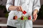


Plating is the cheapest quality upgrade in a kitchen. The ingredients are already bought, the dish is already cooked, and the difference between a plate that looks ordinary and one that looks expensive is a few decisions about where things go.
That is not a figure of speech. Oxford’s Charles Spence and chef Charles Michel built three versions of the same 31-element salad (a tossed version, an ordered but unaesthetic arrangement, and one composed after a Kandinsky painting) and found diners rated the Kandinsky version as tasting better and were willing to pay more for it (Great British Chefs). Same ingredients, same kitchen, different arrangement.
This guide covers the techniques themselves, in the order a cook actually makes the decisions: plate, structure, space, arrangement, sauce, contrast, garnish. These are plate-level moves for food being served on a plate. If most of your volume goes out in a container instead, the rules change enough that it is a separate subject, and food presentation that survives takeout and delivery covers that side.
Key Takeaways
The same ingredients arranged more carefully measurably raise both perceived taste and willingness to pay, so plating is a pricing lever rather than decoration.
Pick the plate first. A white or neutral plate makes colours read; blue works against almost all food because very little food is naturally blue.
Three distinct heights make a portion look generous without adding cost, which is the most reliable trick in the whole discipline.
Odd numbers and deliberate white space do most of the work in making an arrangement look intentional rather than accidental.
Every technique here has to survive a busy service. A plating standard the line cannot repeat at 8pm on a Saturday is not a standard.
Lower your delivery costs by 23%
How we reduce costs:
- No delivery vehicle expenses
- Optimized local routes
- Pay-per-delivery model
- Average 23% delivery cost reduction
How plating changes what guests think they tasted
Visual presentation is not a separate channel from flavour; it feeds into the judgment of flavour itself. Spence’s broader gastrophysics work found that artistically displayed food, and food placed in the centre of the serving plate, was thought to be worth more money than standard or off-centre plating.
The practical reading for an operator is that plating is part of your pricing argument. If you are charging a premium over the place down the street, the plate is where the guest looks for evidence before the first bite. A dish that tastes like $24 and looks like $12 loses an argument it did not need to have.
This is also why plating pays off twice. The plate in front of the guest is one audience; the photograph of that plate is the other, and menu images, listings and social posts all come from the same work. Research on display format found people were willing to pay 61% more for everyday snack foods presented as real objects rather than as images (Perceived food value depends on display format). That is a reminder that photography flatters less than reality does, so the real plate has to carry the standard.
The five elements every plated dish is judged on
Before individual techniques, the frame. A plated dish is assessed on colour, arrangement, balance, texture and ease of eating.
That last one is the one cooks forget. A dish that has to be dismantled before it can be eaten is a failed dish however good it photographs. Towers that collapse, garnishes that have to be removed, sauces that cannot be reached: all of these trade the guest’s experience for the cook’s. Ease of eating is a constraint on every other technique here, not an afterthought.
The table below sorts the core techniques by what each one actually fixes, which is more useful than a list of tips when you are looking at a plate that is not working.
| Technique | What it fixes | Common mistake |
|---|---|---|
| Plate choice | Colours look dull or the portion looks lost | Patterned or coloured plates competing with the food |
| Height and layering | Plate looks flat and the portion looks small | Towers so tall the guest has to demolish them |
| White space | Plate looks crowded and chaotic | Filling the rim, which reads as mess rather than value |
| Odd numbers | Arrangement looks static or paired off | Scattering items with no focal point |
| Sauce work | Dish looks unfinished or sloppy | Flooding the plate so everything sits in liquid |
| Colour contrast | Dish reads as one beige mass | Adding colour that has no reason to be in the dish |
| Texture contrast | Dish feels monotonous to eat | Crisp elements added early that go soft before service |
| Garnish | Dish lacks a finishing point | Garnish that is not edible or not related to the dish |
Choose the plate before you arrange the food
The plate is a decision, not a container. White or neutral is the safest choice for most food because it makes colours stand out, and blue should generally be avoided since very little food is naturally blue, so the contrast reads as wrong rather than striking.
Size matters as much as colour. A portion on an oversized plate looks mean; the same portion on a correctly sized plate looks generous. If you are trying to make a dish feel more substantial without increasing food cost, going down a plate size is free.
Shape should follow the food. Long dishes suit rectangular plates, saucy dishes need a rim or a bowl, and anything with height needs a plate wide enough to give it a base. Dark plates make brightly coloured ingredients pop and bring a more modern, upscale feel, which is worth having in the rotation for the right dishes.
Build height and layers so the dish has structure
Flat food looks like less food. Having three different heights on the plate fills the space and makes a portion look bigger without adding an ounce to it.
The standard method is to build upward in order of stability: a base of starch or a smear of purée, vegetables or garnish layered on, protein placed to lean against or sit on that base. The base does structural work. It stops the components sliding apart, which is what makes a stacked plate survive the walk to the table.
Protein gives you the easiest height win. Slicing meat at a 45-degree angle against the grain produces a more tender cut and exposes the interior texture, and fanning those slices against a base creates both height and a visible reason for the guest to look at the dish.
The limit is the ease-of-eating rule. If the guest has to knock the dish over to start, the tower was for you rather than for them.
Use white space deliberately
The empty part of the plate is part of the composition. Crowding is the most common plating fault in working kitchens, because the instinct under pressure is to put everything down and move on.
Give each component room. A dish with clear space around it reads as composed and confident; the same food pushed to the edges reads as careless. Leaving the rim clean is the single easiest discipline to enforce: nothing on the rim, no smears, no stray sauce.
White space also looks more expensive, which is the uncomfortable truth behind fine-dining plating. Space signals that the portion was chosen rather than dumped. If you are plating in a value format, the same principle still applies at a smaller scale: keep the rim clean and let the food have edges.
Arrange in odd numbers and give the eye a focal point
Items in odd numbers (three scallops, five ravioli, three stacks of something) produce a more natural and dynamic composition than even groupings, which the eye resolves into pairs and stops looking at.
Alongside that, every plate needs somewhere to look first. Usually that is the protein or the most visually interesting component, and usually it belongs at or near the centre, given Spence’s finding that centred food is perceived as worth more. Everything else is positioned in relation to that focal point.
A useful discipline is to decide, before you touch the plate, what the guest should see first. Cooks who do this produce plates that look intentional even when they are improvising, because the composition has a logic to it.
Sauce techniques that look intentional
Sauce is where a competent plate becomes a finished one, and it is also where most sloppiness shows. The main techniques are worth knowing by name because they suit different dishes:
-
Brushstrokes. A pastry brush dragged through a thick sauce or purée gives a bold sweep with direction. Best for purées that hold their shape.
-
Drizzling. Pouring gently over or around the dish for a natural flow. Forgiving, and fine for most thin sauces.
-
Dotting. Small uniform dots, often in a line or arc, creating pattern and letting the guest control how much they take.
-
Splattering. A flicked burst of colour. Looks deliberate only when the rest of the plate is disciplined, and unforgivable on a dirty rim.
The rule across all of them is that sauce should be placed, not poured over everything. Flooding the plate drowns texture, makes crisp elements soggy within a minute, and removes the guest’s ability to decide how much sauce they want. Where a dish needs a lot of sauce, serve the component on top of it rather than under it, or bring extra separately.
Build contrast into colour and texture
Contrast is what stops a well-arranged plate from being boring.
On colour, the move is to pair bright vegetables against neutral proteins, or to add a controlled pop with herbs, microgreens or edible flowers. The constraint is relevance: colour that has nothing to do with the dish reads as a garnish problem. If the green on the plate is not something the guest wants to eat with the rest, it is decoration rather than cooking.
On texture, combine smooth with crisp: a silky purée against crunchy onion straws, a soft protein against something toasted or crumbled. Combining textures makes a dish more dynamic to eat as well as to look at, which is the pairing you want.
Timing is the operational catch. Crisp elements go soft the moment they meet moisture, so they go on last, after the sauce, seconds before the plate leaves. A plating standard that puts the crisp element on early is quietly producing a soggy dish every time.
Modern plating styles worth having in the rotation
Beyond the composed round plate, several styles are standard in current practice:
-
Free-form plating. Appears carelessly strewn but every placement is considered, producing an abstract composition. Works when the kitchen is confident; looks like a mistake when it does not.
-
Organic materials. Wood, slate and stone as the serving surface, giving a rustic, back-to-nature read. Wooden boards have become a staple plate alternative.
-
Deconstructed dishes. Components presented separately so the guest mixes, stacks or dips. Adds interactivity, and has the practical advantage that nothing is pre-assembled to go soggy.
-
Themed presentation. Food, tableware and décor aligned to tell one story. Strongest for events and set menus, and it pairs naturally with a seasonal menu built around what is at peak, where the ingredient itself supplies the theme. Catering work rewards it most, because a single composed look repeated across a room reads as far more considered than it costs, which helps when you are keeping event catering margins healthy on a tight food budget.
-
Cross-cultural composition. Dishes that borrow from more than one tradition tend to arrive with built-in colour and texture contrast, which is half of plating solved before you start. Fusion cooking and how it changes a dish is worth understanding for that reason alone, since the contrast comes from the ingredients rather than from garnish added on top.
-
Unconventional vessels. Cake stands for multiple courses, desserts in teacups, dishes in natural materials. Use sparingly, since a vessel the guest cannot eat out of comfortably fails the ease-of-eating test.
Making a plating standard survive a real service
A technique that only works when the kitchen is quiet is not a technique, it is a photograph.
Three things make plating hold up under volume. First, write the plate down: a simple diagram or photo card at the station, so the arrangement does not depend on who is working. Second, pre-portion the components that can be pre-portioned, so plating is assembly rather than decision-making. Third, cut the number of elements until the plate can be built in the time the station actually has. A four-element plate executed consistently beats an eight-element plate executed once.
It is also worth knowing which of your dishes are plated food and which are, in practice, something else. Off-premises volume now dominates most operations, and the economics of that shift are covered in the fast casual restaurant trends that are worth the money. For dishes going into a container, almost none of the height-and-white-space work transfers, and the standards should be written separately rather than hopefully.
Frequently Asked Questions
What are the basic food plating techniques?
The core set is plate selection, building three distinct heights, leaving deliberate white space, arranging components in odd numbers around a focal point, placing sauce rather than pouring it, and contrasting both colour and texture. Garnish finishes the plate and should always be edible and related to the dish.
What are the five elements of food presentation?
Colour, arrangement, balance, texture and ease of eating. Ease of eating is the one most often sacrificed, and sacrificing it is what turns an impressive plate into a frustrating meal.
Does plating actually affect how food tastes?
It affects how people judge taste, which is what matters commercially. In Spence and Michel’s salad study, the same 31 ingredients arranged in a Kandinsky-inspired composition were rated as tasting better and valued more highly than the tossed or plainly ordered versions.
What colour plate is best for food presentation?
White or neutral for most dishes, because it lets the food’s colours read clearly. Dark plates suit strongly coloured ingredients and give a modern, upscale impression. Blue is generally a poor choice: almost no food is naturally blue, so the contrast reads as off rather than striking.
How do you make a small portion look bigger?
Reduce the plate size, build three levels of height instead of spreading food flat, and keep clear space around the components. All three make a portion read as generous without changing the food cost, which is why they are the first adjustments to make on a dish whose margin is tight.