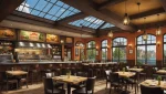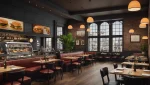


Ask ten restaurant owners what their brand is and eight will describe their logo. The logo is maybe a tenth of it. Your brand is the thing that makes a customer recognize you in a stranger’s photo, pick your bag out of three on a lobby table, and describe you to a friend in one sentence without mentioning your name.
That recognition is worth money, and it’s the part of marketing that gets cut first because it doesn’t produce a number this month. This guide covers what restaurant branding is actually made of, how to keep it consistent in a business where half your customers never see your room, and when rebranding is justified. For where brand fits against the channels that do produce numbers this month, see restaurant marketing for delivery orders.
The Bottom Line
- Vistaprint’s hospitality survey found 89% of small business leaders credit branding as a key contributor to their success, 87% say it helps attract new customers, and 93% say it builds trust.
- For any restaurant doing takeout or delivery, packaging is the brand surface with the widest reach you own, because it touches every channel you have.
- Four things need to be standardized before anything else: logo placement, an exact colour palette, one or two typefaces, and a consistent tone of voice.
- Rebranding is justified by a changed business, not by boredom with your logo.
Lower your delivery costs by 23%
How we reduce costs:
- No delivery vehicle expenses
- Optimized local routes
- Pay-per-delivery model
- Average 23% delivery cost reduction
What restaurant branding actually includes
Brand identity covers your name, logo and visuals, but it also covers your menu, your service, your online presence and your catering program. In practice, here’s the full list of what a customer reads as “you”, and where each piece shows up.
| Brand element | Where a customer meets it | How it goes wrong |
|---|---|---|
| Name and logo | Signage, listings, bags, social avatar | Illegible at thumbnail size |
| Colour palette | Packaging, menu, interior, posts | Different hex codes on every printed thing |
| Typography | Menu, signage, labels, website | Four fonts because four suppliers |
| Photography style | Listings, social, delivery apps | Mixed daylight, flash and stock |
| Tone of voice | Menu copy, replies, email, social | Formal on the website, chatty on Instagram |
| Packaging | Every takeout and delivery order | Generic containers with a sticker |
| Menu design and naming | Dine-in, listings, apps | Dish names that mean nothing to a stranger |
| Service style | Room, phone, delivery handoff | The one element nobody documents |
The list is long, but the work isn’t proportional to it. Most of these are decided once and then simply enforced, which is why the hard part of branding is consistency rather than creativity. For the wider context on where brand sits among the levers restaurants pull, MenuTiger keeps a roundup of restaurant marketing statistics.
Metrobi is transforming catering deliveries
Specialized solutions for catering businesses:
- Catering-trained drivers
- Proper handling equipment
- Peak day delivery support
- 23% average cost reduction
The four brand elements to standardize first
If you do nothing else, pin these down and write them somewhere your printer, your designer and your next hire can find.
- Logo placement. Same position, same relative size, every surface. Decide it once for a bag, a box, a cup and a label.
- Colour palette. Exact hex codes, and the print equivalents. “Our green” is not a specification; suppliers will each pick a different green and you’ll never notice until you see them side by side.
- Typography. One or two typefaces, used the same way each time: one for headings, one for body. Three is already too many.
- Messaging tone. Your taglines, your social handles, and how you sound. A sentence or two of description is enough: “plain, warm, never exclamation marks” does more work than a brand deck.
These four are the difference between a restaurant that looks like a restaurant and one that looks like itself. They’re also the brief you hand an outside designer, which matters, because a logo produced without them will be pretty and inconsistent with everything around it.
Why packaging is the most important brand surface for delivery
For a restaurant doing meaningful takeout or delivery volume, packaging is the one element that touches every channel consistently. It’s in the review photo, the unboxing video, the office lunch that twelve people saw, the bag on someone’s passenger seat.
That makes it a better investment than most of what gets called branding. A well-branded box does brand work at the moment the customer is most receptive, when they’re hungry, opening something and about to decide whether you were worth it. Then it does the work again as content when they photograph it.
Practical version: one branded bag, one sticker or label system that works across container sizes, and a consistent insert. You don’t need custom-printed clamshells in nine sizes. A generic container with a properly designed label reads as intentional; a premium container with no branding reads as somebody else’s. Packaging spend is easier to justify once you have seen how much of restaurant marketing now happens off-premise, which the restaurant marketing statistics roundup is a useful sanity check on.
This is also the point where brand and reputation meet. The photo a customer takes of your packaging ends up attached to their review, and reviews are doing more work for you than most brand assets. See why restaurant reviews are important for winning new customers for what that’s worth in revenue.
Keeping your brand consistent from dining room to delivery bag
The awkward truth about a delivery-heavy restaurant is that you have two brands running whether you intended to or not: the one people experience in the room, and the one that arrives in a bag forty minutes later. If those two feel like different businesses, your brand isn’t building.
Things that drift without anyone deciding they should:
- Plating versus travel. A dish designed for a plate often arrives looking nothing like the photo that sold it. Either redesign the dish for travel or photograph it as it actually arrives.
- Voice across channels. Careful prose on the website, jokes on Instagram, curt one-liners in review replies. Pick one register.
- Menu naming. In-room servers can explain a dish with a cryptic name. A listing can’t. If a name needs a server, the listing needs a description.
- Photography. Your own photos, your app listing photos and your social photos should look like they came from the same restaurant. They usually don’t.
Your social feed is where most of that inconsistency shows up first, because it’s updated most often by the most people. Getting the visual language settled before you scale posting saves rework later. The posting side is covered in social media marketing for restaurants.
How brand work makes the rest of your marketing cheaper
Brand doesn’t produce orders directly, which is why it’s hard to defend in a budget meeting. What it does is lower the cost of everything that does produce orders.
A customer who already recognizes you converts at a higher rate off the same listing, needs fewer touches before a first order, and is likelier to try a new item. That means your ad spend buys more, your email gets opened more, and your app listing wins more of the coin flips against the place next door. Channel-by-channel restaurant marketing benchmarks are the easiest way to see which of those multipliers is worth most in your case. It’s a multiplier on the tactics rather than a tactic itself, which is exactly why it belongs in the plan alongside the faster-moving items on our list of restaurant marketing ideas.
It also makes premium mechanics viable. Gift cards are a good example: people buy gift cards for restaurants they can name and describe, which is a brand test dressed up as a revenue channel. The economics are in the benefits of a restaurant gift card program.
When rebranding is worth it, and when it isn’t
Rebranding is expensive, disruptive, and occasionally the right call. The test is whether your business has changed, not whether you’ve grown tired of your logo.
Reasons that hold up:
- Your menu or concept has shifted and the name or look now misdescribes you.
- Delivery and takeout became a major channel and your identity was built entirely for a room.
- You’re opening a second location and the current identity doesn’t scale past the first.
- There’s a legal or trademark problem, or a name collision that’s costing you search traffic.
Reasons that don’t: a competitor got a nice new logo, you’ve had the current one for five years, or someone on staff doesn’t like the colour. Before spending on a rebrand, check the published restaurant marketing statistics against your own numbers. More often than not the gap is in listings, photography or reviews rather than identity. A refresh (cleaning up the logo, fixing the colour palette, replacing the photography) gets you most of the benefit for a fraction of the cost and none of the risk of becoming unrecognizable to your regulars.
If you do go ahead, keep the recognizable thing recognizable. Customers’ memory of you is the asset you’re spending; a rebrand that throws away the one shape or colour people knew you by starts you back at zero.
Who should do your branding work
Logo and identity design is the piece of restaurant marketing most worth buying, because it’s a one-off with a long life and it’s hard to do well. That’s a different proposition from buying ongoing marketing services, and it’s a much easier decision: a fixed project with a deliverable you either like or don’t.
What you shouldn’t do is hand over strategy along with the design. Nobody can tell a designer what your restaurant is about except you, and the brief matters more than the designer. If you’re weighing up outside help more broadly, the costs and vetting questions are in how to choose a restaurant marketing agency.
Frequently asked questions
What are the main elements of restaurant branding?
Name and logo, colour palette, typography, photography style, tone of voice, packaging, menu design and service style. The first four are the ones to lock down first, because everything else is built on top of them.
How much does restaurant branding cost?
A logo and basic identity from a freelance designer typically runs in the low thousands; a full identity system with packaging design costs more. The bigger cost is usually implementation (new signage, printed packaging and menus), so plan that before commissioning the design.
Does branding matter for a delivery-only restaurant?
More, not less. A delivery-only restaurant has no building doing the work, so the bag, the label and the listing carry the entire identity. Packaging is the primary brand surface rather than a secondary one.
How often should a restaurant rebrand?
Only when the business changes: a new concept, a new channel, a second location, or a legal problem. A visual refresh every five to seven years keeps things current without spending the recognition you’ve built.