

Coffee shop design has two jobs: convince the person walking past to come in, and make the person already inside want to come back. Everything else (the tile you chose, the pendant lights, the reclaimed wood) is in service of those two jobs or it’s decoration you paid for.
Most independent cafes get the second job right and the first one wrong. The inside is warm, the playlist is good, the regulars love it, and 400 people a day walk past the window without registering that it’s open. Fixing that is cheaper than a renovation. It’s usually glass, light, a door and a sign.
This post covers the room as a customer experiences it: the three seconds from the sidewalk, the light that decides how long they sit, the seating mix that serves three different kinds of visit, and the counter that either invites an order or hides one. For what goes behind that counter, see the coffee shop equipment checklist; if you’re adding off-premise orders, how to start coffee shop delivery covers the handoff side.
The Bottom Line
- Light decides dwell time. In a study of 918 shoppers, time spent in a store was positively associated with soft lighting and negatively associated with red interior color.
- Design for three visits, not one: the two-minute commuter, the twenty-minute catch-up, and the two-hour laptop session. Each needs different seating.
- The 2010 ADA Standards require at least 5% of dining surfaces to be accessible, dispersed through the room rather than grouped in one corner.
- A record 40% of away-from-home coffee buyers now order through an app, so the pickup point is a design element, not a shelf you add later.
- Spend on glass, light and signage before furniture. Those three decide whether anyone sees you.
Boost customer satisfaction with just a few clicks
Most-Loved Features:
- On-demand drivers
- Real-time GPS tracking
- Delivery confirmation photos
- Over 50% of customers report a smoother delivery experience
What coffee shop design is actually for
A cafe’s interior is a demand-generation tool that happens to hold chairs. Judge every design decision against one of three outcomes: more people come in, people stay longer or spend more while they’re in, or people come back next week.
That framing kills a lot of expensive ideas. A sculptural light fixture over an unused corner fails all three. A window bar facing the street passes the first and third: people outside see other people drinking coffee, which is the oldest and best advertisement a cafe owns.
The academic work points the same way. A 2024 study of customers at three coffee shops examined how the physical characteristics of a cafe shape satisfaction and the intention to return, and treated ambiance as a driver of repeat visits rather than a backdrop to them (International Journal of Social Science and Humanities Research, May 27, 2024). The room is part of the product.
Coffee shop curb appeal: the three seconds from the sidewalk
You get about three seconds of a pedestrian’s attention, and most of what wins it is free or close to it.
- Open the sightline. Clear the bottom two-thirds of the window. Vinyl graphics, stacked boxes and chalkboards at eye level all signal “closed” to someone glancing sideways at walking speed. People coming in want to see people already in.
- Prop the door when the weather allows. A closed door on a quiet street reads as a private business. An open one reads as an invitation, and the smell does work no sign can.
- Put activity in the window. A bar seat, a pour-over station, a pastry case facing out. Visible human movement is the strongest attractor a frontage has.
- Light the exterior at opening. If you open at 6:30am in winter, you open in the dark. An unlit facade is invisible; a warm-lit one is the only thing a passer-by can see on a street of shuttered storefronts.
- One legible sign, readable at 30 feet. Name, and the word coffee. Script fonts that photograph well are often unreadable from across the street.
Walk out to the opposite curb and look at your own shop at 7am, 1pm and 6pm. Most owners have never done it, and it’s the cheapest audit available.
Lighting a coffee shop so people stay longer
Warm, soft, layered light keeps people seated. Cold, flat, overhead light moves them along. That is a legitimate choice for a kiosk and a costly accident for a cafe that needs the afternoon.
The research is unusually clear here. A study of 440 men and 478 women aged 20 to 60 found time spent in the store was positively associated with soft lighting conditions and negatively associated with red interior color (Barlı et al., Color Research & Application, 2012). Warm white light around 2700K also produced more reported pleasure than cool white at 6500K in display-focused retail studies.
Practical version for a cafe:
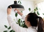
- Three layers. Ambient (general), task (the bar, the till, the pastry case), accent (retail shelf, art, plants). One layer of recessed cans is what a dentist’s waiting room has.
- Warm ambient, neutral task. Keep the room between 2700K and 3000K. Light the espresso bar a little cooler and brighter so your baristas can actually see the crema.
- Dim the room as the day goes. A fixed brightness that works at 7am is harsh at 5pm. Dimmers are the cheapest atmosphere upgrade on the list.
- Light the food, not the ceiling. A well-lit pastry case sells pastries. A beautifully uplit ceiling sells nothing.
- Never backlight the counter. If a bright window sits behind your baristas, customers see silhouettes, and the menu board behind them is unreadable.
A cafe seating layout that fits three kinds of customer
Your seating is a bet on how long people stay. Make it deliberately, because every seat type attracts a different ticket and a different turnover.
Three visits to design for:
- The two-minute commuter. Wants no obstacles between the door, the till and the exit. Standing room, a shelf for a lid-and-sleeve moment, nothing else.
- The twenty-minute meeting. Two-tops and window perches. This is the highest-value seat per square foot in most cafes, and the one owners under-supply because large tables look more generous.
- The two-hour laptop session. Needs power, a hard surface and a wall. Worth hosting in the hours you have spare capacity, worth containing in the hours you don’t.
A workable mix for a 1,200 square-foot shop: roughly half two-tops, a quarter counter or window stools, a quarter soft or communal seating, with the laptop-friendly seats clustered away from the door and the till.
Two constraints are not optional. First, accessibility: the 2010 ADA Standards require at least 5% of dining surfaces (and never fewer than one) to be accessible, with those surfaces dispersed through the room rather than parked in a back corner, plus clear floor space and knee clearance underneath (ADA.gov). Second, somebody has to run the room: reset tables, move the laptop crowd gently at 8am, decide whether the four-top gets split. That is a daily management job, which is one reason hiring a coffee shop manager well matters more than any floor plan.
Coffee shop counter design that reads as an invitation
The counter is where design turns into revenue. Three things decide whether it works, none of them about where the counter sits.
What’s on display at eye level. A pastry case at chest height with three visible, well-lit items outsells a crowded case under glare. Rotate the hero item; leave gaps. A packed case reads as yesterday’s stock.
Whether customers can see the craft. An exposed bar where people watch a shot pull and milk steam justifies your prices in a way a sign never will. Hiding the machine behind a wall of cups saves space and costs you the show.
Whether the menu is legible from the back of the queue. Six to eight drinks, prices aligned, type big enough to read from ten feet. If people arrive at the till still deciding, your line is slower and your average ticket is lower.
Your retail shelf belongs in this zone too: bags of beans, at hand height, with origin and roast date facing out. That shelf is also where your sourcing story earns money: shoppers reading a bag want to know where it came from, which is the practical argument in why ethically sourced coffee matters to your customers.
Small coffee shop design ideas that buy you square footage
Under 800 square feet, design is mostly subtraction.
- Build up, not out. Wall-mounted shelving and tall retail displays free the floor. Vertical storage above the bar keeps the back-of-house out of the room.
- Stools over chairs. They tuck under, weigh less, take less depth and turn faster.
- One communal table instead of four small ones. It seats more people in the same footprint and makes a half-empty room feel busy.
- A window bar along the glass. The cheapest seating you can install, and it doubles as frontage advertising.
- Mirrors on the long wall. The oldest trick in small-room design, and it still works.
- Mobile furniture. Anything on casters lets you reconfigure for an event, a catering pickup or a Saturday rush.
What not to cut: the queue. A line that backs into the doorway loses the customers behind it. Leave the path from door to till clear even when every seat is full.
Designing for the 40% who order ahead
App and order-ahead traffic has changed what the front of a cafe has to do. In the National Coffee Association’s Fall 2026 survey, 40% of people who bought coffee away from home in the past week ordered through an app, a record, up from 36% a year earlier (Daily Coffee News, September 15, 2026; fielded June 8-24, 2026 by Dig Insights among 1,882 US adults).
Those customers need a different path through your room than the ones ordering at the till:
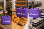
- A visible, labeled pickup point that isn’t the till. A shelf, a small table, a window: anywhere a person can grab a cup without joining the queue.
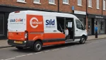
- Sightlines for couriers. Somebody carrying a thermal bag should be able to see where the order is from the doorway. Otherwise they walk to the counter and interrupt the till.
- Space for the order to sit. Four drinks in a carrier and a pastry bag need a surface. A 12-inch shelf doesn’t cut it.
- Signage. “Mobile pickup” in large type saves your baristas a hundred interruptions a week.
Build the handoff where the tickets print, which is a reason to settle your coffee shop POS system and your pickup zone in the same conversation rather than six months apart.
Materials, acoustics and the things that age badly
Pick surfaces for their second year, not their first week.
- Acoustics first. Hard floors, hard ceilings and glass make a room that’s unusable for conversation at 60% capacity. Soft ceiling panels, a rug under the soft seating, upholstered backs and plants all buy back the twenty-minute meeting.
- Light wood and painted plaster age well. Matte black, reclaimed barnwood and anything heavily themed dates fast and photographs as “2019”.
- Avoid porous counters near the bar. Milk, syrup and espresso stain. Sealed stone, stainless and solid surface stay looking new; untreated timber doesn’t.
- Specify floors for wet shoes. The six feet inside your door are wet for four months of the year. Slip rating and a proper mat well are design decisions, not janitorial ones.
- Plan for cables. Outlets at seated height, under tables or along a window bar. Extension leads across a walkway are both a hazard and a visual mess.
Signage and a menu board people can actually read
Three signs do almost all the work, and most shops get one of them right.
Outside: the name, the word coffee, and your hours. Legible at 30 feet, lit when you’re open in the dark.
At the till: the menu, six to eight drinks, prices aligned down one edge. Seasonal items on a separate small board so the main board never gets rewritten mid-rush.
At the pickup point: “Mobile and delivery pickup”, in type as large as the menu’s headings.
Hand-lettered chalk is charming and slow to read. If you keep it, keep the lettering simple and the contrast high. The point of a menu board is throughput, not personality.
Frequently asked questions
How much does it cost to design and fit out a coffee shop?
Design and build-out is usually the largest single line in opening a cafe, and it varies by whether you inherit plumbing and ventilation or install them. The cheap, high-return items are consistent: lighting, window clearing, signage and seating mix. Those can be improved for a few thousand dollars in an existing shop.
What are the best colors for a coffee shop interior?
Warm neutrals with one accent. Research on store environments found time spent was positively associated with soft lighting and negatively associated with red interior color, so a red-dominant room is working against you if you want people to linger.
How many seats should a small coffee shop have?
In an 800 to 1,200 square-foot shop, 20 to 35 seats is a common range once the counter, back-of-house and queue path are accounted for. The mix matters more than the count: under-supplying two-tops is the most frequent mistake.
Should coffee shops allow laptops?
Design for them rather than banning them, and zone them away from the door and till. Power outlets and a wall seat in the quiet half of the room keep long-stay customers from blocking the seats you need during the rush.
Does the counter need to be visible from the street?
The activity does. If someone passing by can see a barista working, steam rising and people holding cups, you’ve advertised without spending anything. Blocked windows are the most common and most expensive design mistake in independent cafes.
Where to spend first
If your budget is small, in this order: clear the windows, relight the room, replace the sign, fix the seating mix. Furniture last. The first three decide how many people come in; the fourth decides how long they stay.
Walk to the opposite sidewalk tomorrow morning and look at your own shop the way a stranger does. Whatever you notice in those three seconds is your design brief.