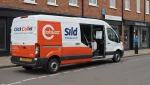


Most logo projects start in the wrong place: a mood board, a competitor’s mark someone liked, a designer asking which of three directions feels right. The result looks fine and means nothing, because nothing in the process ever connected the shape to what the business actually stands for.
A brand identity logo earns its keep when someone who knows nothing about you can look at it, then deal with you, and find the two consistent. That is the whole standard. This guide covers how to get there. It also covers how to check the mark still works where your customers see it, because it spends most of its life on a box and a van door rather than a screen.
Key Takeaways
- Your logo is one element of a brand identity that also includes color, typography, imagery and voice. Designing the mark first and the rest later is why so many identities feel disconnected.
- Values have to be translated into specific visual decisions about weight, shape, palette and type, or the alignment exists only in the brief.
- Be careful with the widely quoted claim that color increases brand recognition by 80%. The Loyola study behind it measured information processing in documents and graphs, not logo recall.
- For a business that delivers, the real proof is a vinyl decal at twenty feet and a one-color stamp on a box, not the presentation deck.
Lower your delivery costs by 23%
How we reduce costs:
- No delivery vehicle expenses
- Optimized local routes
- Pay-per-delivery model
- Average 23% delivery cost reduction
What a brand identity logo is, and what it is not
A logo is the mark. A brand identity is the full visual and verbal system: the logo plus the color palette, typography, photography style, layout conventions and tone of voice that appear alongside it. And the brand itself is larger still. It includes your pricing, your reliability and what happens when an order goes wrong, which is the subject of our broader guide to what business branding is and why it matters.
The distinction matters because it determines the order of work. If you commission a logo before deciding what the business stands for, the designer has to invent values on your behalf or default to whatever is fashionable in your category. That is how a family bakery ends up with the same minimal sans-serif wordmark as a software startup.
So the sequence is: values, then identity system, then logo as the compressed expression of both.
Start with three words you would defend
Before any visual work, write down the two or three commitments you would keep even when they cost you money. Not adjectives everyone claims. Quality, passion and integrity are worthless here, because no competitor claims the opposite.
Useful values are specific enough to be refused. Examples from businesses that deliver their own product:
- Nothing goes out that we would not serve at home, even if it means calling the customer to say today’s batch is short.
- The grower or maker is named on every card, because we are a conduit, not the origin.
- The delivery window we promise is the one we hit, and if we miss it you hear from us before you notice.
Now translate each into a visual question. “We are a conduit, not the origin” argues for a mark that recedes and gives room to someone else’s name on the label: restrained, secondary, probably a wordmark rather than a loud pictorial symbol. “Nothing goes out we would not serve at home” argues for warmth and evidence of the human hand: drawn rather than geometric, a palette borrowed from the product rather than from a trend.
That translation step is the entire job. Everything after it is craft.
How color and typography carry values
Color does real work, but the evidence for it is routinely overstated.
The claim you will meet everywhere is that color increases brand recognition by up to 80%, attributed to a University of Loyola, Maryland study. The underlying research was about how color improves the processing of information in text and graphs, not about logo recall (insights4print, 2019). That matters, because a designer who justifies a palette with that statistic is quoting a telephone game rather than a finding.
What does hold up is the weaker, more useful version: consistent use of a distinctive color makes a brand easier to recognize, and color is one of the first things people recall about a mark. Research summarized in the same area found participants far more able to recall a logo’s primary color than the company’s name. For a business whose van passes the same block three times a week, design around that asymmetry: at distance the color does the recognition work, not the wordmark.
Typography carries values more precisely than color does, and gets less attention. A geometric sans says systematic and modern. A humanist serif says established and careful. A slightly irregular script says made by a person, and says it so strongly that it will overrule your copy if the two disagree.
The test for both: if you swapped in a competitor’s palette and type, would the mark still say what you mean? If yes, your values are not in the design yet.
Where your logo is actually seen when you deliver
A logo designed only on screen fails in the places a delivering business is judged. Before approving anything, run it through the conditions it will actually face.
| Where it appears | Typical size and constraint | What usually breaks |
|---|---|---|
| Van door or magnetic panel | Read at 20+ feet, moving, often one or two colors | Fine detail disappears; thin strokes vanish; tagline unreadable |
| Shipping box or bag | One-color print, sometimes on kraft brown | Palette-dependent marks lose meaning in mono |
| Label or sticker on the product | Under 1.5 inches, often circular | Horizontal lockups get illegible; needs a stacked variant |
| Delivery notification and app avatar | Square, under 64px, next to other logos | Wordmarks turn to mush; needs an icon-only mark |
| Invoice and paperwork | Black and white, low resolution | Gradients and shadows print as grey sludge |
| Driver’s apron, jacket or cap | Embroidered, limited stitch detail | Anything below a few millimetres of detail is lost |
The practical consequence is that you do not need one logo, you need a small family: a primary lockup, a stacked version, an icon-only mark, and a one-color version that holds up in mono. Ask for all four at the outset. Retrofitting them later is where identities drift out of alignment, because each variant gets improvised by whoever needed it that day.
This is also the cheapest branding upgrade available to most delivering businesses. A mark that works in one color on a kraft box turns every order into a recognition event, which is exactly the kind of low-cost, high-frequency exposure covered in our guide to branding promotion strategies.
A five-step process to align a logo with your values
1. Write the values, in sentences, with the cost attached. One page. If a competitor could sign the same page, it is not finished.
2. Turn each value into a visual constraint. “The maker is named on the card” becomes “the mark must sit comfortably as a secondary element beside another name.” Constraints, not adjectives, are what a designer can work with.
3. Choose the logo type deliberately. Wordmark, lettermark, pictorial, abstract or combination. A combination mark gives you the icon you will need for small and square placements, which is why it suits most businesses that deliver.
4. Test against the placement table above before you fall in love. Print it at sticker size in black and white. Tape it to a van at the far end of the lot and walk away. This costs an afternoon and catches most of the expensive mistakes.
5. Document the rules, then hold the line. Clear space, minimum sizes, approved color values, what is never allowed. Consistency is where the commercial return on identity work actually comes from, and it evaporates the first time someone stretches the logo to fill a space.
How to tell your logo has drifted from your values
The symptoms are usually reported by customers rather than noticed internally:
- People describe your business, unprompted, in words you would not choose: “cheap and cheerful” when you are positioning as craft, or “corporate” when you are family-run.
- Your packaging and your logo feel like they came from different companies, because in effect they did.
- Staff avoid using the mark at small sizes and substitute plain text instead.
- You have more than one version of the logo in circulation and nobody knows which is current.
- The mark looked right when you sold one product and now sits awkwardly on a range you did not have then.
None of these require a full rebrand. Most are fixed by defining the missing variants and writing down the rules that were never written.
Frequently asked questions
What is the difference between a brand identity and a logo?
The logo is a single mark. Brand identity is the whole system it belongs to: color, typography, imagery, layout and voice. You can change a logo without changing an identity, and a coherent identity will carry a mediocre logo far better than the reverse.
Should a small business hire a designer or use a logo maker?
A logo maker can produce something serviceable if your values and constraints are already written down, because you are then selecting rather than hoping. If they are not, a designer’s real value is the interrogation before the drawing. Either way, insist on the full family of variants and a mono version.
How often should a logo be redesigned?
Rarely. Recognition compounds, and every redesign resets some of it. Refresh when the business has changed what it does or who it serves. Do not refresh because the mark feels dated to you, since you see it several hundred times more often than your customers do.
Does a logo need to explain what the business sells?
No, and forcing it usually dates the mark. What the logo needs to do is be distinctive, legible at the sizes you actually use, and consistent with the experience that follows it. Context does the explaining.
The check that matters
A brand identity logo is aligned when the promise it implies and the experience you deliver are the same thing. That is easier to verify than to design: put the mark next to a photograph of one of your actual deliveries, the box and the van and the doorstep as they are, and ask whether a stranger would guess they belonged together.
If they would, the alignment is real. If the mark looks like it belongs to a more expensive, more careful, or more casual business than the one in the photo, you have found the gap. Close it from whichever side is cheaper to move.